BusinessBalls.com Website Optimisation
Recommendations made based on analytics and heatmap analysis, coupled with qualitative research, have led to 32% increase in Account sign up numbers during project phase.
Content of this case study
Context
Problem Statement
Target User / Persona
Outcome / Impact
Tasks Performed & Methods Used
How Research Impacted Design
Lessons Learnt / Next Steps
More Details
Client Location
United Kingdom
Team Size
1 Person
Final Prototype
BB.com Prototype
Project Duration
1 Month
Team Role
UX Designer
Skill Areas Demonstrated
Pre-Qualification Survey, UX Research, Heuristic Evaluation, Customer Journey Mapping, A/B Testing, Wireframing, Prototyping (Figma), Usability Testing

Context
BusinessBalls.com is a UK-based e-learning website established in 2010 that provides free resources on leadership, management, and personal effectiveness. Given the strong online traffic it has (average 700k unique page views per month), the management decided to start monetising its content.
They needed some advice around optimising the User Experience of the website prior to a site-wide launch of new content and paywall structure.
The project was performed remotely with the client who are based in the UK, within a one-month period.
Problem Statement
HOW MIGHT WE improve the website and page structures SO THAT we can increase site traffic to access premium benefits of the website and increase account sign up rate.
Target User / Persona
“Team Leader Upskilling to Cope With Growing Business Needs.”

Outcome / Impact
-
A few changes have been made to the live Businessballs website, which in turn has resulted in a 32% increase in Account Sign Up numbers during the project phase.
-
Made a number of recommendations on website structure, account and price plan sign up user journey, and content strategy, which the client has included on their book of works to be actioned over the next 6 months.

Top-Up Options screen - Basic Plan users can purchase top-up options to suit their learning needs.

"
Ivy has been amazing! She did a really great job, especially with the payment / checkout process.
Sascha Benson-Cooper | Managing Director, BusinessBalls
Client
"
Tasks Peformed and Methods Used

How Research Impacted Design
-
Analysis of Analytics Data, Heatmap and Qualitative Research results supported changes made to the live Home Page, to test for impact on Account Sign-Up, clicks on content below the fold, and traffic to pages with premium content.
-
Feedback from Usability Tests led to several suggestions made to the client, including:
-
Legibility of the top menu
-
Layout and details provided on course overview pages
-
Layout of E-Module pages
-
Account Sign-Up Page - sign up options & layout
-
Price Plan Sign Up Page - information available and layout
-
Home Page
Before
(Heatmap from 24 Jun 20, 1000 views)
After
(Heatmap from 29 Jul 20, 1000 views)

Research findings leading to design changes on the Home Page:
-
Analysis of the "Before" Heat Map Data (left) indicated that majority of the clicks are concentrated on the part of the page that is above the fold;
-
Usability test results indicated that being able to see a summary of sign-up benefits can entice account sign sign-up
-
users felt the ad space in the middle of the page was disrupting the flow when browsing the page.
Changes made:
-
A pink "Create a Free Account" button was added to the main banner of the page to capitalise on the banner space.
-
A secondary banner listing sign-up benefits have been added (under the main banner)
-
Removed Ad Space in the middle of the page to encourage the browsing of below the fold content.
Top Menu
Existing Website
Prototype

Users found the font size and colour make the menu items hard to read - hence in the prototype the colour and font size have been adjusted to increase legibility.
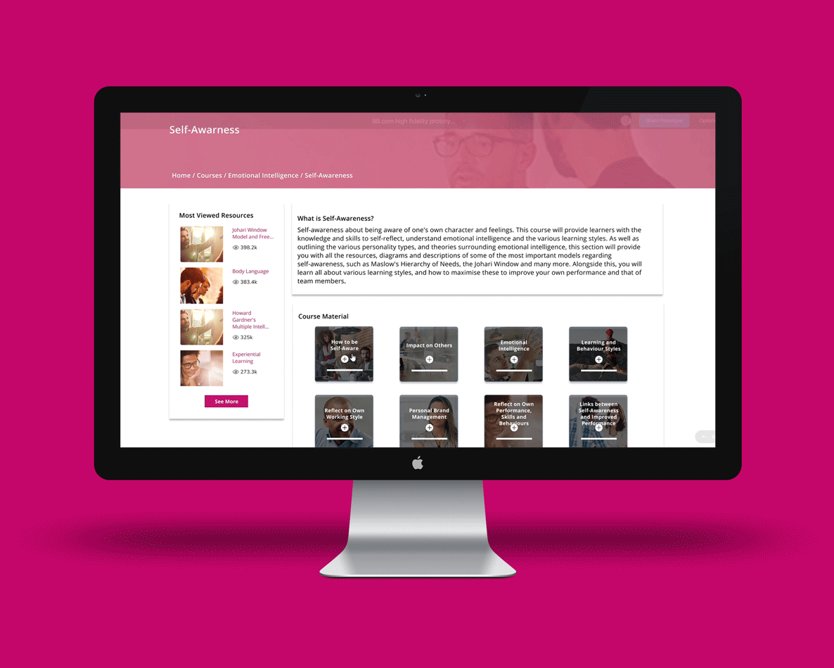
Course Overview Landing Page
Existing Website
Prototype

Users did not understand how the individual learning resources related to each other for the existing website. As a result, the layout of the course landing page was changed to help users understand the course structure better.
Account Sign Up Page
Existing Website
Prototype

Users feedback indicate most of them have LinkedIn accounts, and found the drop down boxes in the original account sign up page a hassle to use. As a result, a LinkedIn sign up option was added and radio buttons were used to replace the drop down boxes.
Lessons Learnt / Next Steps
-
Fairer incentive should be offered to improve response to online user recruitment reqeuest.
-
The client should be involved more in the design process to increase their sense of ownership of the final solution.
-
The A/B Test results did not confirm all the hypotheses made - next step would be to further modifty design and run more rounds of test.